Week 03: Graphing and aggregating#
Learning outcomes#
After completing this lesson students will be able to
create basic data visualizations using plotnine
build and execute a chain of commands to accomplish a data management task
create summary statistics using
groupbyandaggregate
Preparation#
To follow along with this Lesson, please open the Colab notebook Week 03 Notes. The first code cell of this notebook calls to the remote computer, on which the notebook is running, and installs the necessary packages. For practice, you are repsonible for importing the necessary packages.
Graphing#
The syntax of ggplot#
The reason we use the functions in plotnine is for consistency in the structure of it’s arguments. Here is the bare bones plotting syntax. All capital letter variables are meanto be filled in, but note that not all variables are required for any given plot type. It will take some time and practice to understand which plot types require which variables.
import numpy as np
import pandas as pd
import plotnine as pn
pn.ggplot(data = DF) + pn.geom_PLOTTYPE(pn.aes(x = "X_VAR", y = "Y_VAR", fill = "FILL_VAR", group = "GROUP_VAR"))
DFis the name of the DataFrame in which the variables for your plot livePLOTTYPEis the plot type you want to make e.g. histogram, density, boxplot, point*_VARare variables from the DataFrame; don’t forget the quotes
msleep DataFrame#
We’ll use the msleep DataFrame from the package plotnine.
from plotnine.data import msleep

msleep
| name | genus | vore | order | conservation | sleep_total | sleep_rem | sleep_cycle | awake | brainwt | bodywt | |
|---|---|---|---|---|---|---|---|---|---|---|---|
| 0 | Cheetah | Acinonyx | carni | Carnivora | lc | 12.1 | NaN | NaN | 11.9 | NaN | 50.000 |
| 1 | Owl monkey | Aotus | omni | Primates | NaN | 17.0 | 1.8 | NaN | 7.0 | 0.01550 | 0.480 |
| 2 | Mountain beaver | Aplodontia | herbi | Rodentia | nt | 14.4 | 2.4 | NaN | 9.6 | NaN | 1.350 |
| 3 | Greater short-tailed shrew | Blarina | omni | Soricomorpha | lc | 14.9 | 2.3 | 0.133333 | 9.1 | 0.00029 | 0.019 |
| 4 | Cow | Bos | herbi | Artiodactyla | domesticated | 4.0 | 0.7 | 0.666667 | 20.0 | 0.42300 | 600.000 |
| ... | ... | ... | ... | ... | ... | ... | ... | ... | ... | ... | ... |
| 78 | Tree shrew | Tupaia | omni | Scandentia | NaN | 8.9 | 2.6 | 0.233333 | 15.1 | 0.00250 | 0.104 |
| 79 | Bottle-nosed dolphin | Tursiops | carni | Cetacea | NaN | 5.2 | NaN | NaN | 18.8 | NaN | 173.330 |
| 80 | Genet | Genetta | carni | Carnivora | NaN | 6.3 | 1.3 | NaN | 17.7 | 0.01750 | 2.000 |
| 81 | Arctic fox | Vulpes | carni | Carnivora | NaN | 12.5 | NaN | NaN | 11.5 | 0.04450 | 3.380 |
| 82 | Red fox | Vulpes | carni | Carnivora | NaN | 9.8 | 2.4 | 0.350000 | 14.2 | 0.05040 | 4.230 |
83 rows × 11 columns
Univariate (one variable)#
categorical variable#
For one categorical variable, possibly the simplest way to present data is in a
table. A table for a categorical variables displays the counts of the unique
categories in the variable of interest. Consider the variable conservation in
the DataFrame msleep. The easiest way to get counts of the categories in the
variables conservation is with .value_counts.
msleep["conservation"].value_counts()
conservation
lc              27
domesticated    10
vu               7
en               4
nt               4
cd               2
Name: count, dtype: int64
Alternatively, you could make a bar chart. Remember, if you want to exclude the missing data, you have to remove them first from the DataFrame, specifying the column of interest.
p = pn.ggplot(data = msleep) + pn.geom_bar(pn.aes(x = "conservation"))
p.draw()
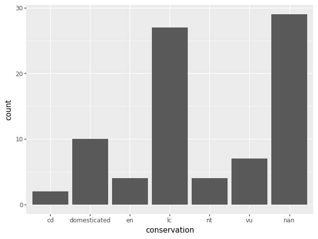
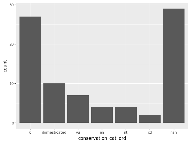
If you want to order the categories in a certain way, you are in charge of creating a new variable that has the specified order of interest. Here’s some code to order the categories in decreasing order of their counts. Note that missing values are always drawn last, even if this seems to mess up the ordering.
conservation_cats_ord = msleep["conservation"].value_counts().index.tolist()
msleep["conservation_cat_ord"] = pd.Categorical(msleep["conservation"], categories = conservation_cats_ord)

p = pn.ggplot(data = msleep) + pn.geom_bar(pn.aes(x = "conservation_cat_ord"))
p.draw()
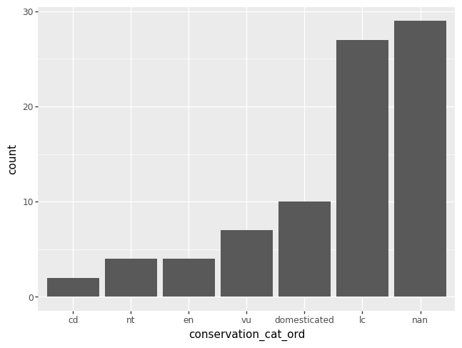
You could also use list indexing to order the categories in increasing order.
msleep["conservation_cat_ord"] = pd.Categorical(msleep["conservation"], categories = conservation_cats_ord[::-1]) # notice the indexing

p = pn.ggplot(data = msleep) + pn.geom_bar(pn.aes(x = "conservation_cat_ord"))
p.draw()
numeric variable#
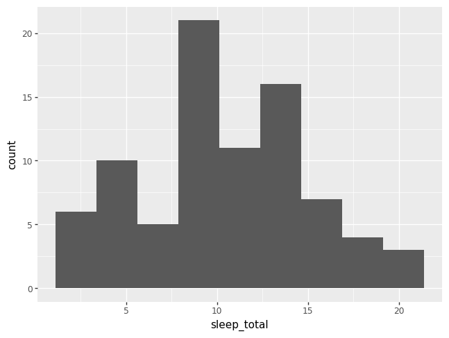
Rather than showing the value of each observation of a numeric variable, it is common to display the value as belonging to a bin. The height of each bar in a histogram records the frequency of values that fall into each bin. The x-axis for a histogram is different from a bar chart, because a histogram has a numeric x-axis, whereas a bar chart has a categorical x-axis.
p = pn.ggplot(data = msleep) + pn.geom_histogram(pn.aes(x = "sleep_total"))
p.draw()
/opt/hostedtoolcache/Python/3.9.21/x64/lib/python3.9/site-packages/plotnine/stats/stat_bin.py:109: PlotnineWarning: 'stat_bin()' using 'bins = 7'. Pick better value with 'binwidth'.
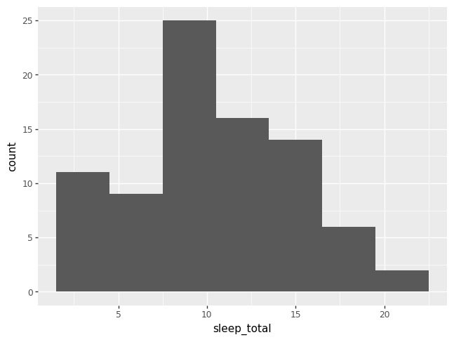
Notice that plotnine issued a warning about choosing the number of bins. If you don’t specify the number of bins, plotnine will choose for you, and also yell at you.
There is no one right choice for the number of bins. Generally, between 7 and 51 are good first guesses.
p = pn.ggplot(data = msleep) + pn.geom_histogram(pn.aes(x = "sleep_total"), bins = 9)
p.draw()
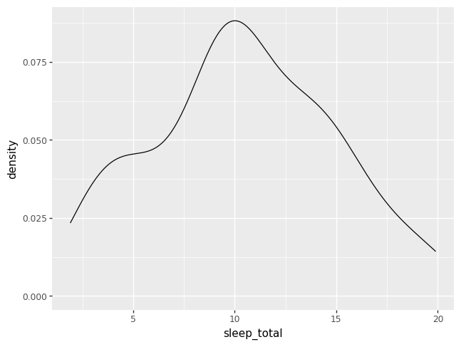
A density plot is like a histogram that has been smoothed over.
p = pn.ggplot(data = msleep) + pn.geom_density(pn.aes(x = "sleep_total"))
p.draw()
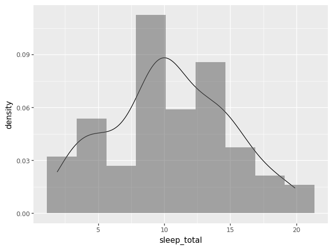
The benefit of adding + layers of geom_PLOTTYPEs is that we can combine
plots to help us understand better the data. The code below layers a histogram
and a density plot, and specifies two other options. First, to force the
histogram onto the samw scale as a density plot, use y = pn.after_state("density"). Second, we make transparent the histogram by
specifying alpha = 0.5. The keyword argument alpha ranges from 1, by
default, to 0 completely transparent.
p = (pn.ggplot(data = msleep)
    + pn.geom_density(pn.aes(x = "sleep_total"))
    + pn.geom_histogram(pn.aes(x = "sleep_total",  y = pn.after_stat("density")), alpha = 0.5, bins = 9))
p.draw()
Bivariate (two variables)#
categorical variables#
More sophisticated tables of categorical variables can be with the Pandas
function pd.crosstab. One of the benefits of pd.crosstab is that you cross
tabulate multiple Series.
pd.crosstab(msleep["conservation"], msleep["vore"])
| vore | carni | herbi | insecti | omni |
|---|---|---|---|---|
| conservation | ||||
| cd | 1 | 1 | 0 | 0 |
| domesticated | 2 | 7 | 0 | 1 |
| en | 1 | 2 | 1 | 0 |
| lc | 5 | 10 | 2 | 8 |
| nt | 1 | 3 | 0 | 0 |
| vu | 4 | 3 | 0 | 0 |
You can also request proportions, instead of counts in the cross tabulated
table. If you want to get proportions relative to the rows, you specify the
keyword argument normalize equal to "index". If you want proportions
relative to the columns, use "columns". And if you want proportions relative
to the entire table, use "all".
pd.crosstab(msleep["conservation"], msleep["vore"], normalize = "all").round(3)
| vore | carni | herbi | insecti | omni |
|---|---|---|---|---|
| conservation | ||||
| cd | 0.019 | 0.019 | 0.000 | 0.000 |
| domesticated | 0.038 | 0.135 | 0.000 | 0.019 |
| en | 0.019 | 0.038 | 0.019 | 0.000 |
| lc | 0.096 | 0.192 | 0.038 | 0.154 |
| nt | 0.019 | 0.058 | 0.000 | 0.000 |
| vu | 0.077 | 0.058 | 0.000 | 0.000 |
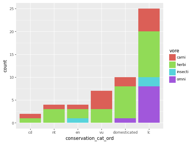
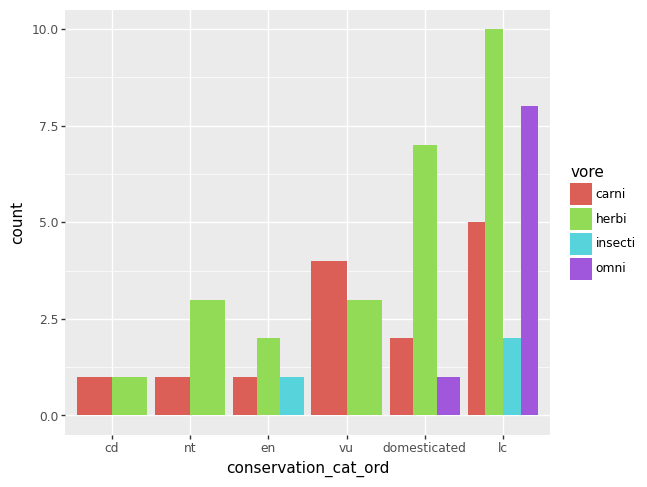
The plot equivalent of a cross tabulated table might be a grouped bar chart. As of 2023-12-20, plotnine will yell at you if there are any missing data, so let’s remove the missing data from our two variables of interest first.
df = msleep.dropna(subset = ["conservation_cat_ord", "vore"])
p = (pn.ggplot(data = df)
    + pn.geom_bar(pn.aes(x = "conservation_cat_ord", fill = "vore")))
p.draw()
df = msleep.dropna(subset = ["conservation_cat_ord", "vore"])
p = pn.ggplot(data = df) + pn.geom_bar(pn.aes(x = "conservation_cat_ord", fill = "vore"), position = "dodge")
p.draw()
numerical variables#
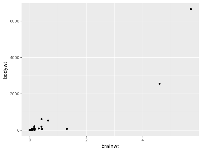
The most common method of visualizing the relationship between two numeric
variables is by using a scatterplot. With ggplot we specify both the x and y
variables, and the geometry geom_point.
p = (pn.ggplot(msleep, pn.aes(x = "brainwt", y = "bodywt"))
    + pn.geom_point())
p.draw()
/opt/hostedtoolcache/Python/3.9.21/x64/lib/python3.9/site-packages/plotnine/layer.py:364: PlotnineWarning: geom_point : Removed 27 rows containing missing values.
The most common trend line added to a scatterplot is the so called best fit, or
least squares line. This is done by adding a geom_smooth() layer. A least
squares line should only be used for linearly related numerical variables, and
sometimes you can help linearize variables with log transformations.
p = (pn.ggplot(msleep, pn.aes(x = "brainwt", y = "bodywt"))
    + pn.geom_point()
    + pn.geom_smooth(se = False, color = "blue")
    + pn.scale_x_log10()
    + pn.scale_y_log10()
    + pn.labs(x = "log of brain weight", y = "log of body weight"))
p.draw()
/opt/hostedtoolcache/Python/3.9.21/x64/lib/python3.9/site-packages/plotnine/layer.py:364: PlotnineWarning: geom_point : Removed 27 rows containing missing values.
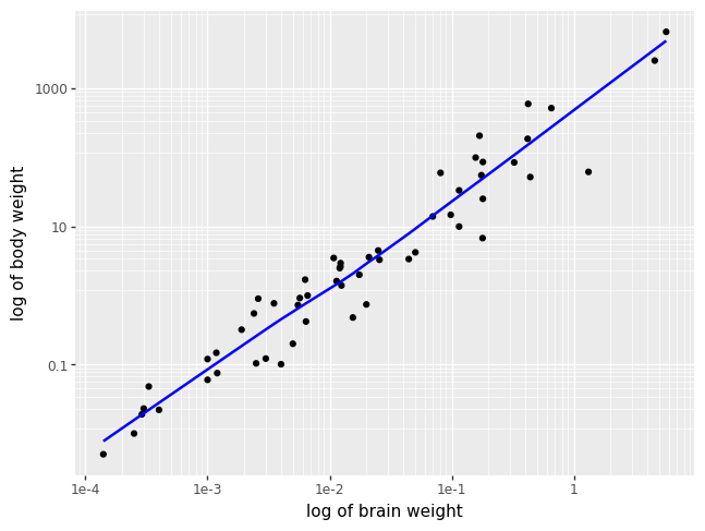
Look back at the slightly changed in syntax in the last two plots. Both the
dataset and the aesthetic specification showed up as positional arguments,
instead of the dataset as a keyword argument and the aesthetic specification in
the geometry layer. With the syntax as in the last two examples, the aesthetic
specification is shared across both the geom_point and the geom_smooth
layers. All other examples have provided a syntax where the aesthetic is
specific to a single layer and not all subsequenty layers.
numerical and categorical#
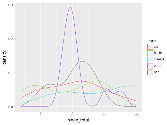
One can combine plots for numeric variables with categorical information by repeating each plot type above for each category of a categorical variable, where each category is drawn in a unique color. When coloring across a categorical variable like this, a legend becomes necessary.
p = (pn.ggplot(data = msleep)
    + pn.geom_density(pn.aes(x = "sleep_total", color = "vore")))
p.draw()
Alternatively, you can put the categorical variable on an axis and summarize the numerical variable on the other axis.
p = (pn.ggplot(data = msleep)
    + pn.geom_boxplot(pn.aes(x = "vore", y = "sleep_total")))
p.draw()
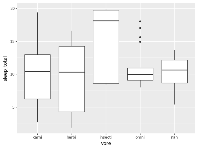
Sometimes it is helpful to add a violin plot layer, if the box plots are not capturing all of the information in the density of the data. Otherwise, it can just be fun.
df = msleep.dropna(subset = "vore")
p = (pn.ggplot(df, pn.aes(x = "vore", y = "sleep_total", fill = "vore"))
    + pn.geom_boxplot(width = 0.2)
    + pn.geom_violin(alpha = 0.1))
p.draw()
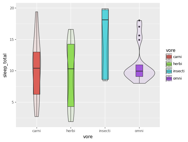
It seems as of 2023-12-23 that filling by a categorical variable does not work
appropriately if there is any missing data. The plot above works, if you first
drop the NAs.
Aggregating#
In Week 02, we learned how to summarize numerical variables by themselves. The latter plots above provide graphical summaries of numerical variables across a categorical variable. Aggregating, or aggregation, is all about calculating summaries of numerical across a categorical variable.
The first step in aggregating is to group a DataFrame by the categories, or
levels, of some categorical variables. The Pandas function groupby carries
out this task for us. You can group by a single categorical variable, as we do
below, or group by a list of categorical variables.
gdf = msleep.groupby("vore", as_index = False)
gdf
/tmp/ipykernel_2035/151992987.py:1: FutureWarning: The default of observed=False is deprecated and will be changed to True in a future version of pandas. Pass observed=False to retain current behavior or observed=True to adopt the future default and silence this warning.
<pandas.core.groupby.generic.DataFrameGroupBy object at 0x7f90cb769940>
By itself, groupby is pretty boring and doesn’t obviously do much. The real
power of group by is when you couple it with the function aggregate, which
can be abbreviated to agg.
odf = gdf.aggregate(
    mean = ("sleep_total", np.mean),
    sd = ("sleep_total", np.std),
    count = ("sleep_total", np.size))
odf
/tmp/ipykernel_2035/2079833150.py:1: FutureWarning: The provided callable <function mean at 0x7f911036a5e0> is currently using SeriesGroupBy.mean. In a future version of pandas, the provided callable will be used directly. To keep current behavior pass the string "mean" instead.
/tmp/ipykernel_2035/2079833150.py:1: FutureWarning: The provided callable <function std at 0x7f911036a700> is currently using SeriesGroupBy.std. In a future version of pandas, the provided callable will be used directly. To keep current behavior pass the string "std" instead.
| vore | mean | sd | count | |
|---|---|---|---|---|
| 0 | carni | 10.378947 | 4.669116 | 19 |
| 1 | herbi | 9.509375 | 4.878746 | 32 |
| 2 | insecti | 14.940000 | 5.920557 | 5 |
| 3 | omni | 10.925000 | 2.949019 | 20 |
The code above can be a lot to take in at first. And to be honest, it is more
complex than necessary. The structure of the aggregate code above is the most
explicit, in the hope that you can see all the necessary pieces of the puzzle
and understand how they fit together.
The basic pattern of the keyword arguments to aggregate go like this. You
specify as a keyword argument the name of the output variable of interest.
These output variables will show up as columns of the output DataFrame, along
side the grouping variable(s). So we actively chose the output variable names
mean, sd, and count. We could have just as well chosen the output
variables names to be horse, octopus, and badger, but obviously more
meaningful variables are better.
On the right hand side of each equals sign, for each keyword argument, you put
within a left/open and right/close parenthesis the name of the numerical
variable you want to act on, and then the function that will act on the
numerical variable you specified. The numerical variable must live in the
DataFrame you are aggregating, and the function to be applied to your numerical
variable must take only one numerical variable as its first argument, as does
np.mean, np.std, and np.size.
The output DataFrame can now be acted on just like anyother DataFrame we’ve
worked with previously. For instance, we can create a Series based on variables
from odf and insert this new Series into the DataFrame odf or we can make
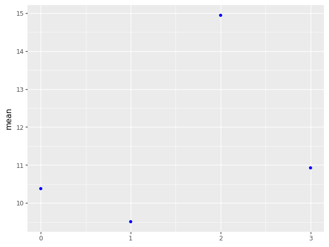
plots from odf. We’ll spend some more time on the details of the plot below
in Week 04: Filling in some details.
odf["se"] = odf["sd"] / np.sqrt(odf["count"])

p = (pn.ggplot(odf)
    + pn.geom_point(pn.aes(x = odf["vore"].cat.codes, y = "mean"), color = "blue"))
p.draw()
See also
